It’s a designer’s dream come true for our industry trends to make mainstream news—to every so often be the unlikely cream that rises in pop culture. I relish that little moment in the sun given to each year’s color trend predictions. Widely featured in recent media coverage, global color authority Pantone controversially named not one, but two (scandalous!), colors of the year for 2016: Rose Quartz and Serenity. The annual announcement—anticipated by design and fashion professionals and fans alike—has press (super important!) from The New York Times, Wall Street Journal, Today, and ABC to Apartment Therapy, InStyle, The Huffington Post, and Design Milk in conversation about gender-blurring hues of mineral pink and soft blue and their potential sociopolitical connotations.
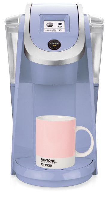
Keurig K250 featured on Sprudge.com
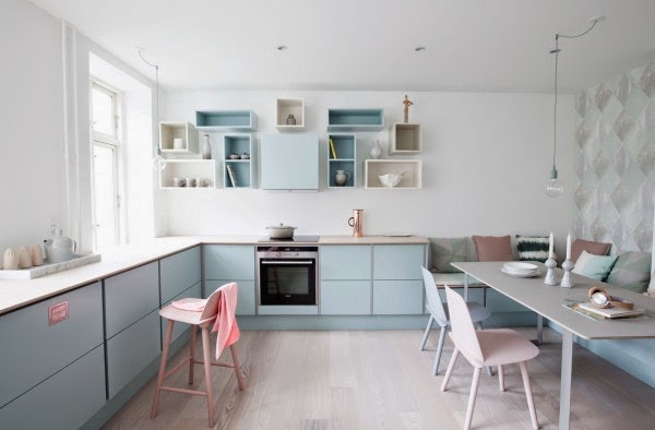
Pastel Kitchen Images by Lamų Slėnis, Italy
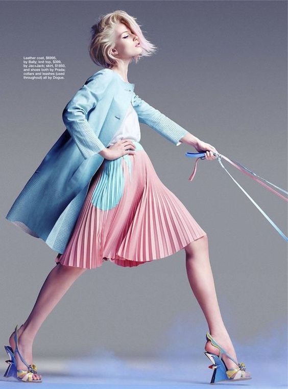
H-A-L-E 2016 Pantone Color of the Year in Fashion
Vanessa Friedman (The New York Times) writes: “I don’t think I’ve ever seen quite so much political and philosophical import attached to a color decision as I have for the 2016 “Color of the Year.”
For the first time, it’s a blend of two colors: Rose Quartz (a kind of mineral pink) and Serenity (a light blue). On the company’s website, the colors flow seamlessly into each other so that it’s impossible to tell where one begins and the other ends.
Two colors! It may not sound revolutionary, but everything is relative. And know this: It’s not about indecision, but social progress. That’s Pantone’s position, anyway.”
It goes without saying that choosing a color for a client’s branding, a particular project, or even the smallest detail of a packaging design feels important. To a graphic designer, those details are monumental and put a lot of weight on our creative shoulders to get it right and help hone clients’ brand positions. An interesting infographic on the science of color forecasting seen in Design Taxi hypothesizes that:
- Making a decision about a color is 95% intuitive and emotional, and only 5% rational.
- Up to 90% of snap judgments about products can be based on color alone.
- 75% of human experience is filtered through our eyes (so color is important!)
Vogue UK Unveils the Color of the Year
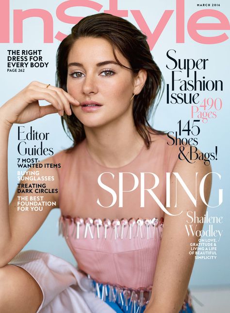
Shailene Woodley on the March 2016 Cover of InStyle
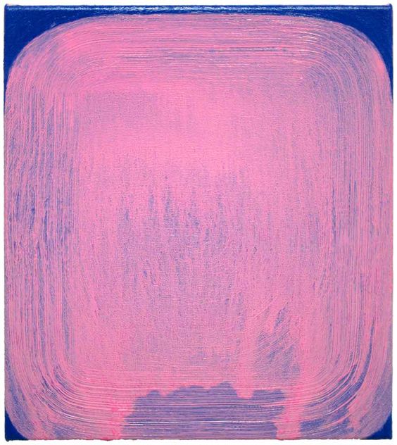
Osamu Kobayashi at the Mindy Solomon Gallery, Miami
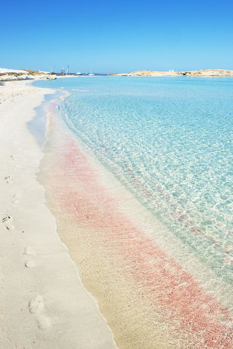
How much truth is in Pantone’s color of the year predictions, and how often has the pairing of this year’s choices been seen in the real world so far, as our second month of 2016 rolls to a close? Indeed, let me count the ways: cups, clothes, fine art, makeup, paper products, print pieces, hair dye, furnishings…the list goes on. Here is a brief Pinterest roundup of Pantone-predicted (or dictated) color sightings that caught my eye.
Whether foretelling is more an educated guess or self-fulfilling prophecy, you be the judge. Either way, Pantone’s picks drive the market. From high fashion to manufacturing, here’s how.
“Pantone selects the yearly color trend by polling designers, manufacturers, and retailers about what tones they are planning to use in their products in the next year.
Rose Quartz and Serenity have been spotted in the Spring 2016 collections of Prada, Thom Browne, Chanel, Valentino, and Carolina Herrera.
Will we see an avalanche of Rose Quartz and Serenity-hued artworks in gallery shows and art fairs across the world in the next few months?” asks Lorena Muñoz-Alonso on ArtNet.
Never to be outdone in the realm of color clairvoyance, as this winter’s snow continues to accumulate Pantone has already released its top ten picks for next fall’s fashion trends. (And, you guessed it, magazines from GQ to WWD are already buzzing about the unisex shades spec’ed for men and women alike: Riverside, Airy Blue, Sharkskin, Aurora Red, Warm Taupe, Dusty Cedar, Lush Meadow, Spicy Mustard, Potter’s Clay, and Bodacious.)
“These additions up Pantone’s color library to 2,310 shades at a time when Instagram and Snapchat are helping to expose people to a wider range of colors. [Leatrice] Eiseman [executive director of the Pantone Color Institute] said, “The more that people see involving color, the more fascinated they become by it. Seeing how others wear or use color enables people to see color outside their own sphere.”
…Pantone has introduced six new colors for fall…meant to drum up interest among consumers.” writes WWD.
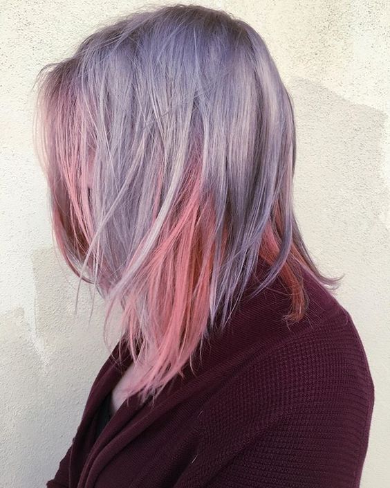
Rose Quartz and Serenity Inspired Locks by Modern Salon
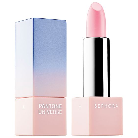
2016 Layer Lipstick at Sephora
Want more? Get on the Pantone Twitter train for your daily dose of color. I also like Design Seeds‘ simple palette blog for a little pick-me-up.
Confession: if I ever retire as a graphic designer, I want to be a color-namer. (Also, any male Santa Fe clients ready for some nice pink business cards—you know who to call!)
~
Kristin Carlson
Owner/Designer, Think All Day
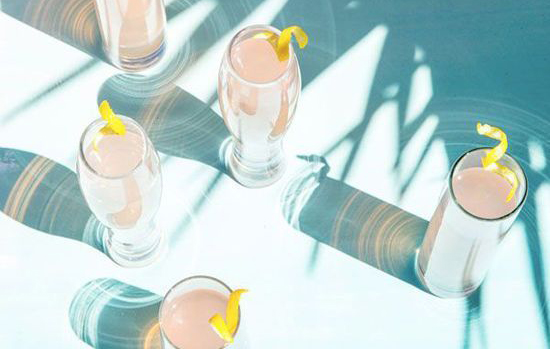
Rose quartz cocktails in featured photo by The Zoe Report